Website Design Best Practices for Outdoor Businesses + Conversion Optimization
Your outdoor business website should work as hard as you have worked to get where you are. Yet most outdoor businesses and adventure companies lose over 70% of website visitors before they click "Book Now." The difference? Design choices that either inspire action or create friction.
Bottom line: Outdoor businesses need websites that balance emotion with function—showcasing breathtaking adventures while making booking frictionless. This guide reveals proven tactics that transform browsers into booked customers. And it's not as hard as you think!!!
Understanding Your Customer Beyond Age and Income
Demographics tell you nothing about motivation. A 35-year-old booking a fishing charter might be a nervous first-timer or a seasoned angler—and they need completely different messaging.
The best tip we can give you for this is - Build personas around fears and desires instead. What almost stopped them from booking? What sealed the deal? Survey your past customers with forms or questionnaire tools and ask directly. These answers become your design roadmap.
Your customers are spending 5+ hours daily on phones, comparing options, reading reviews, and expecting instant answers. They're making decisions while scrolling through Instagram between meetings or sitting in a coffee shop. Your website needs to meet them there.
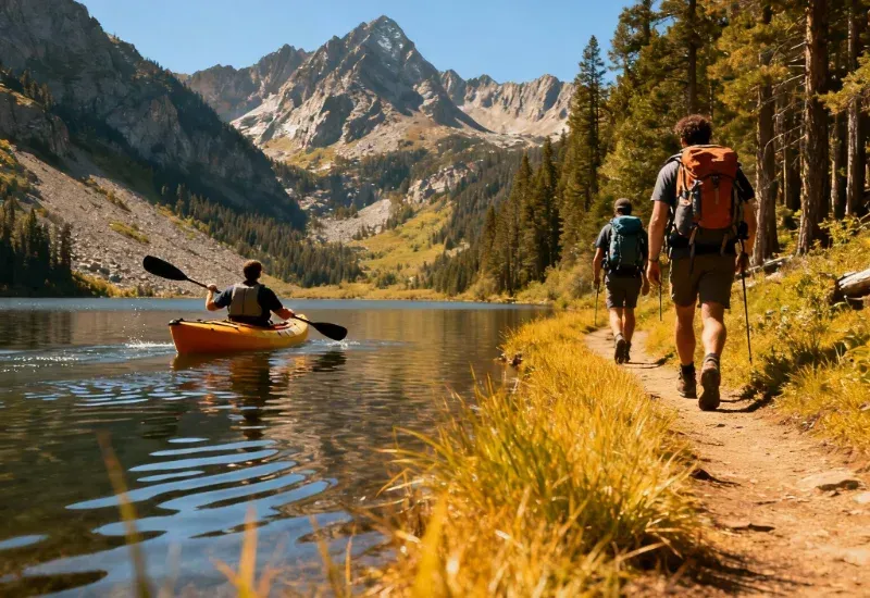
Show the Experience, Not Stock Photos
Adventure businesses and destinations sell feelings, not products. Your website and customer journey visuals need to transport someone to that moment—the spray of whitewater, the sunrise from your lodge deck, the weight of a trophy fish.
Use real photos from real trips. Stock images kill trust faster than anything else you can put on your site. User-generated content works even better because it shows authentic moments without the polish. Don't be afraid to go out and use your phone to take on-location photos to help emulate the experience in a first person POV, this helps them "look through your eyes".
Video changes everything. 84% of people make buying decisions after watching brand videos. Keep them short—30 to 90 seconds showing check-in through the adventure to satisfied faces at the end. This answers questions people don't even know they have.
Mix up your testimonials. Show families, solo travelers, and groups so everyone can see themselves in your experience.
Every Click Should Move Toward Booking - 3 clicks or less
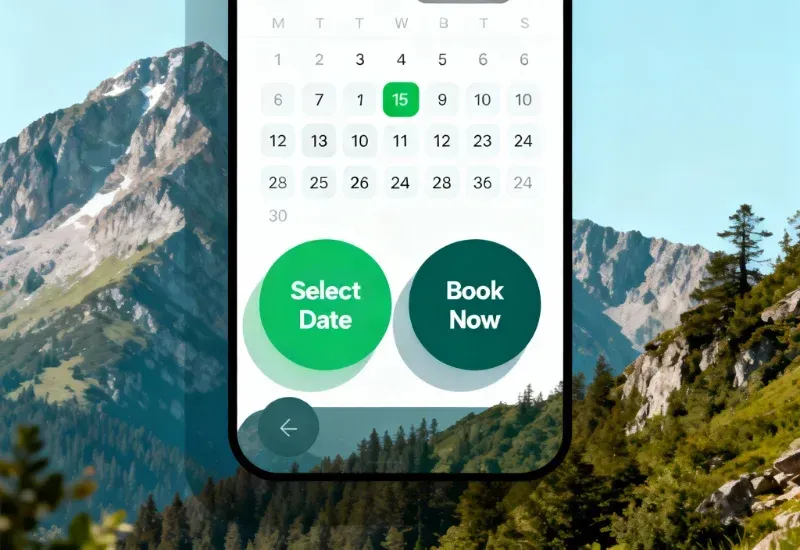
If a design element doesn't push visitors toward booking, cut it. Your navigation should have 5-7 items maximum: Adventures, Book Now, About, Reviews, Safety, Contact. That's it. Use folders to organize additional pages in relevant segments.
Speed kills conversions—or saves them. 53% of mobile users bail if your site takes longer than three seconds to load. Every extra second drops conversions by 7%. Compress images, use lazy loading, and check Google PageSpeed Insights monthly. Not all hosting is equal, some is bare bones and others offer scalable option for hosting that can be tethered to your site. Your booking experience is no different and is often the real killer!
The three-click rule matters. Homepage to booking confirmation in three clicks or less. Don't force account creation. Don't ask for information you don't need right now. Each extra form field drops completion rates by 11%. Your overall booking experience is often the real killer!
And don't forget to send an automated response to let them know that their request or time-slot is seen or confirmed. Bonus if you give them some packing lists, or guides to prep them for you - this also maximizes the experience and adds a higher probability of a better review.
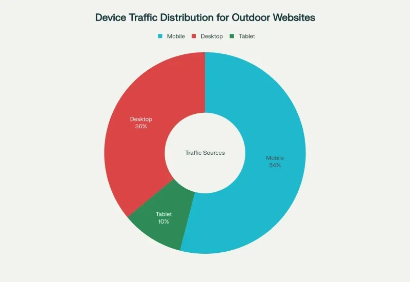
Mobile Isn't Optional Anymore
54% of your traffic will likely come from a mobile device. Most outdoor enthusiasts browse while planning their next adventure from wherever they are - often in a car or on adventure already. They want ease of access, quick responses, and ample information to ease their woes.
Always design for phones first, then scale up. Make buttons big enough to tap—44 pixels minimum. Put your "Book Now" button where thumbs naturally rest on the screen - make them "float" on the screen at the bottom for a truly accessible approach.
Mobile users don't need your full company history or compact designs so cut that out and don't be afraid to use some space around your elements. They need availability, pricing, and a booking button. Give them that and don't make it weird.
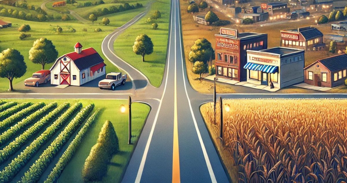
Local Search That Scales - The Programmatic Approach is Your Friend
Build pages for location and activity combinations automatically—"kayak tours Missoula," "rafting guide Bozeman," "fishing charters near Yellowstone." Use structured data so Google understands what you offer and where. Your guests are looking for you and your creative execution is your batarang.
Update these pages monthly with new reviews and recent trip photos. Google loves fresh content and artificial intelligence tools can pick up on it too. Maintenance matters - why do you add your most popular offers to social when it's shelf life is so short?
Link related pages together naturally. If someone's looking at fly fishing guides, show them your fly shop and local fishing spots too. Programmatic site systems win here and the combo is easy to do and efficient to maintain at scale. If you use a CRM like ours, it will tell you the page they submitted from - 1 less question on the form... pretty easy, right?
Forms That Don't Scare People Away
Replace "Learn More" with "Book Your Adventure Today" or "See Available Dates." Specific action language converts 202% better than vague buttons. Showing trust signals everywhere with customer reviews that have real names and photos, safety certifications, BBB badges, secure payment icons will improve your credibility. 91% of people read online reviews before booking anything.
Create real urgency, not fake pressure. Show actual availability: "3 spots left for this date." Mention real seasons: "Best weather June-September." If you use countdown timers, make sure the deadline is legitimate. False urgency destroys trust permanently and will net you a negative reaction.
Break long forms into steps. One big form is intimidating. Three simple screens feel manageable:
- Step 1: Pick your service or adventure
- Step 2: Choose date and group size
- Step 3: Payment and Consent
This simple change can increase completions by 40%.
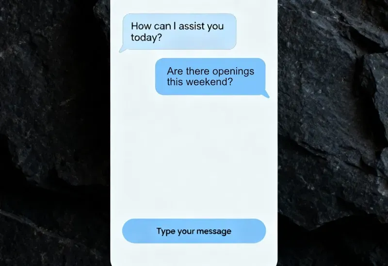
Chat Systems That Book While You Sleep
AI-powered chat handles booking 24/7 when your team is off the grid. Modern systems understand natural requests like "I want to book a sunset kayak tour for 4 people next Saturday" and process them automatically.
Chat reduces booking time by 40% and increases conversions by 35%. People don't want to call during business hours—they're browsing at 10 PM while planning their vacation.
Integrate SMS for follow-ups. Text messages get 98% open rates versus 20% for email. Perfect for time-sensitive bookings and weather updates.
Design chat flows that answer common questions, show real-time availability, suggest add-ons naturally, and transition smoothly to booking. The best systems connect to your calendar so you never double-book.
Automation That Runs Your Marketing
Set up sequences that trigger instantly when someone fills out a form:
- Day 0: Welcome email with booking link and first-time discount
- Day 1: SMS with FAQ video link
- Day 3: Email showing similar adventures with customer photos
- Day 7: Limited-time offer if they haven't booked
Space these 12-24 hours apart. Stay present without being annoying.
After booking, automate everything:
Instant confirmation with itinerary
- 7 days before: packing list, weather forecast, meeting location
- 24 hours before: reminder with parking details
- 24 hours after: review request
- 3 days after: exclusive photos and future trip discount
- 30 days after: seasonal offerings or referral bonus
Recover abandoned bookings automatically. One hour after someone quits your booking form, send a personalized email: "Still thinking about [Adventure Name]?" Include a time-limited discount addressing common objections. Follow up via SMS after 24 hours. This recaptures 10-15% of lost bookings.
Build Trust Through Transparency
Outdoor adventures require people to trust you with their safety, time, and money. You need to earn it.
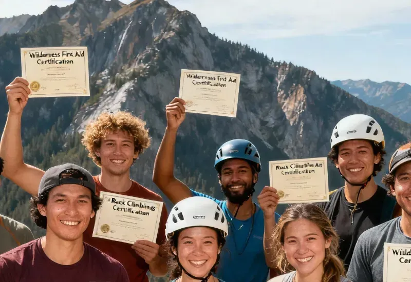
Create detailed safety pages showing certifications, guide qualifications, emergency protocols, and equipment standards. Add video introductions from your lead guides—faces build trust text can't.
Show guide bios with photos, certifications, years of experience, and personal philosophies. Customers want to know who's leading them into the backcountry.
Display social proof strategically. Embed your Instagram feed showing recent adventures. Add auto-updating widgets pulling Google and TripAdvisor reviews. Feature "As Seen In" media logos.
Showcase your environmental commitment. The outdoor audience cares deeply about stewardship. Detail your conservation efforts, Leave No Trace practices, and environmental partnerships. This builds values alignment that transcends price shopping.
Create behind-the-scenes content about guide training, equipment maintenance, and conservation work. This transparency proves professionalism while giving you SEO content.
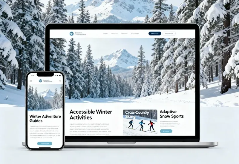
Make Accessibility Your Websites Standard
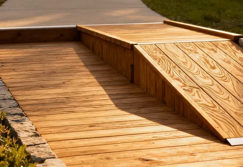
There's a massive underserved market of people eager to experience the outdoors who need accommodation information. Did you know that Oregon became the first "Accessibility Verified" state in 2025. Wheel the World has verified 5,000+ accessible outdoor locations globally. Most outdoor businesses ignore this market entirely—creating huge opportunity for those who don't. And why would you not want to provide your services to these individuals - it's a win win.
Website basics: proper HTML structure for screen readers, descriptive alt text on every image, full keyboard navigation, high-contrast mode options, and video captions. Aim for WCAG 2.0 Level AA compliance.
Provide detailed accessibility info for each adventure on the site so they know and have clear expectations: door widths, ramp specifications, surface types, terrain conditions, mobility aid compatibility, accessible restrooms, and sensory or mobility considerations. Include photos showing accessible routes and facilities.
Add an "I need accessibility accommodations" checkbox to booking forms that triggers staff follow-up. Create a dedicated accessibility page with direct contact information.
What Really Matters - Your Website Should Work Harder Than Anyone
While you're sleeping, your optimized website captures bookings, answers questions, and builds trust with people worldwide planning their next adventure.
Start with mobile-first design. Add 24/7 conversational booking. Implement automation that nurtures leads without manual work. Build trust through transparency about safety, your team, and your values. Make accessibility standard practice, not an afterthought.
Every visitor represents someone dreaming about their next outdoor experience. Your website's job is turning that dream into a booked reality.
Ready to transform your outdoor business website into a booking machine? Check out our Custom Outdoor Business Web Design services and discover how systems-driven marketing elevates every customer touchpoint.